World maps are not neutral and marginalize Africa, says the “Correct the Map” campaign. The European side should therefore review its map materials ahead of the European Union-African Union summit in November, argues Karoline Eickhoff in this Spotlight.

Two visitors look at a world globe titled “The Road to Freedom, Hidden in Plain” by artist Àsìkò Okelarin, on Trafalgar Square. The exhibition „The World Reimagined“ explores the history and impact of the transatlantic slave trade, November 19, 2022 in London, United Kingdom.
© picture alliance / ZUMAPRESS.com | Thomas Krych
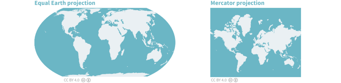
The African Union (AU) recently expressed its support for the “Correct the Map” campaign. Initiated by the advocacy groups Africa No Filter and Speak Up Africa, the campaign calls for international organizations and media outlets such as the United Nations, the World Bank, and the BBC to stop using the Mercator world map. This map enlarges areas near the poles – North America, for example, is depicted as being four times larger than it actually is. Instead, the Equal Earth world map should be used, which shows the actual size of continents and countries and depicts Africa as being significantly larger.
According to the initiators of the campaign, this is not only about the depiction of land masses, but also about the power, perceptions, and false sense of superiority over the Global South that come with it. According to Moky Makura, the executive director of Africa No Filter, the erroneous depiction of Africa on world maps is not only a cartographic error but also a narrative issue, as this way of representing Africa conveys a certain view concerning its place in the world. Selma Malika Haddadi, deputy chairperson of the AU Commission, sees the campaign as an important step in “reclaiming Africa’s rightful place on the global stage”.
Maps Shape Our View of the World
Maps influence our cognitive maps, that is, our perceptions of our environments. These mental maps are simplifications with which we process learnt geographical information, personal experiences, as well as stories, images, and beliefs. However, they are not geographically accurate. Places that are important to us are memorized in detail and enlarged, while unknown regions are distorted or omitted. A widespread cognitive bias, for example, is the assumption that Africa is located in the southern hemisphere. In fact, two-thirds of Africa lies north of the equator. Thus, changing maps can influence people’s perceptions.
The scope of the possible changes in how the world is viewed is illustrated, for example, by the Spilhaus projection of the world map: It shows the seas and oceans as uninterrupted bodies of water bordered by land masses. Antarctica is at the centre of the world map.

At the same time, cartographic information often gives the false impression of objectivity. It shows the location of objects on the Earth’s surface, land masses, bodies of water, and routes from A to B. However, any two-dimensional representation of the spherical world must make compromises somewhere. The Mercator map was designed in the 16th century for maritime navigation. It is angle-preserving and focuses on directions while maintaining the shape of land masses. It is still well-suited for zoomable web maps today. The Equal Earth world map, on the other hand, is area-preserving, meaning that it depicts land masses in their correct size. However, it distorts shapes and angles. The selection of parameters that are depicted and those that are necessarily neglected, therefore, says something about the intentions of the creator and the interests of users.
Centre and Periphery: World Maps as Geopolitics
The campaign gains political significance with the statement that Africa is being deliberately marginalized due to the use of the Mercator map (“intentionally minimises Africa’s true size”). References to power and perceptions also point to this. The assumption here is that this frequently used map is not merely a relic of a bygone era that needs to be corrected, but rather a deliberate utilization of cartographic representation in international politics – in other words, a form of geopolitics.
The question of how geographical representations can play a role in legitimizing global power relations is a subject of “critical geopolitics”. Proponents of this geopolitical school of thought argue that strategic assumptions about geographies which are treated as particularly important in international politics – such as the Bab al Mandab Strait, the Hindu Kush, and the Arctic – are by no means determined by nature. The same applies to conceptions of the world’s “centre” and the “periphery”. Rather, spaces are socially constructed and charged with meaning in order to justify certain political decisions and actions, such as military interventions.
In this reading of geopolitics, maps are representations of a certain conception regarding the world order. However, if they are regarded as neutral representations of reality, the power relations depicted become the natural order in the eye of the beholder.
Critical geopolitics also emphasizes the influence of history on today’s global power relations, which is of great importance in the context of Africa. Mapping played an important role in the imperial ambitions of European colonial powers: the interventionist view of European “explorers” on future settlement areas, arbitrary border demarcations, and the division of the continent into spheres of influence before and during the Berlin Conference of 1884/85. Against this backdrop, current large-scale infrastructure projects, such as regional transport corridors in East Africa, which are linked to external interests in raw materials, are being researched within the context of colonial continuities in the thinking of external actors. From this perspective, our view of Africa’s geography is not neutral, even if contemporary geopolitical analyses often fail to take historical dimensions into account.
This places the issue in a broader context: It is about examining the knowledge products used in foreign and security policy for continuities of colonial “mind maps” and the historical marginalization of Africa.
Under Scrutiny: Visualizations in Africa-Europe Relations
These are highly sensitive issues in the relations between Africa and Europe, also in connection with the AU’s theme of the year: “Reparations for Colonialism and Slavery”. In response to the AU-supported initiative, the European Union (EU) and its member states should approach the campaign as an opportunity to review their use of visualizations – not only world maps, but also cartographic materials relating to Africa in a broader sense. Political (world) maps must be regularly reviewed and updated in any case. Examples of such occasions include the independence of South Sudan in 2011 and the United Kingdom’s withdrawal from the EU in 2020.
It is not necessarily a question of establishing new binding guidelines on forms of representation. No two-dimensional world map is free of distortions; no map can represent an environment without omissions. Depending on the situation, different projections might be appropriate. However, it is important to raise awareness within EU institutions and among the member states that maps are not neutral, and to clearly indicate the underlying assumptions on which maps relating to Africa are based. This applies not only to external communication materials, but also to internal visualizations, for example in connection with scenarios and planning exercises. Who and what is depicted is just as important as who and what is omitted.
This is relevant for the Global Gateway Initiative, under which Team Europe players are being encouraged to invest in infrastructure worldwide, especially in Africa. The projects are accompanied by a dedicated communication strategy designed to bring about a “paradigm shift in the way the relationship between the European Union and partner countries is portrayed and perceived”. Visual communication plays a crucial role. In the documents published so far, there is a continental map of Africa on which the strategic transport corridors selected by the EU are highlighted in colour as areas of interest, as well as the logistical backbones of the corridors (roads, railways, rivers) and catchment areas in relation to investment priorities in sectors such as energy, transport, and digitalization, as well as the project locations and themes of the EU’s flagship projects.
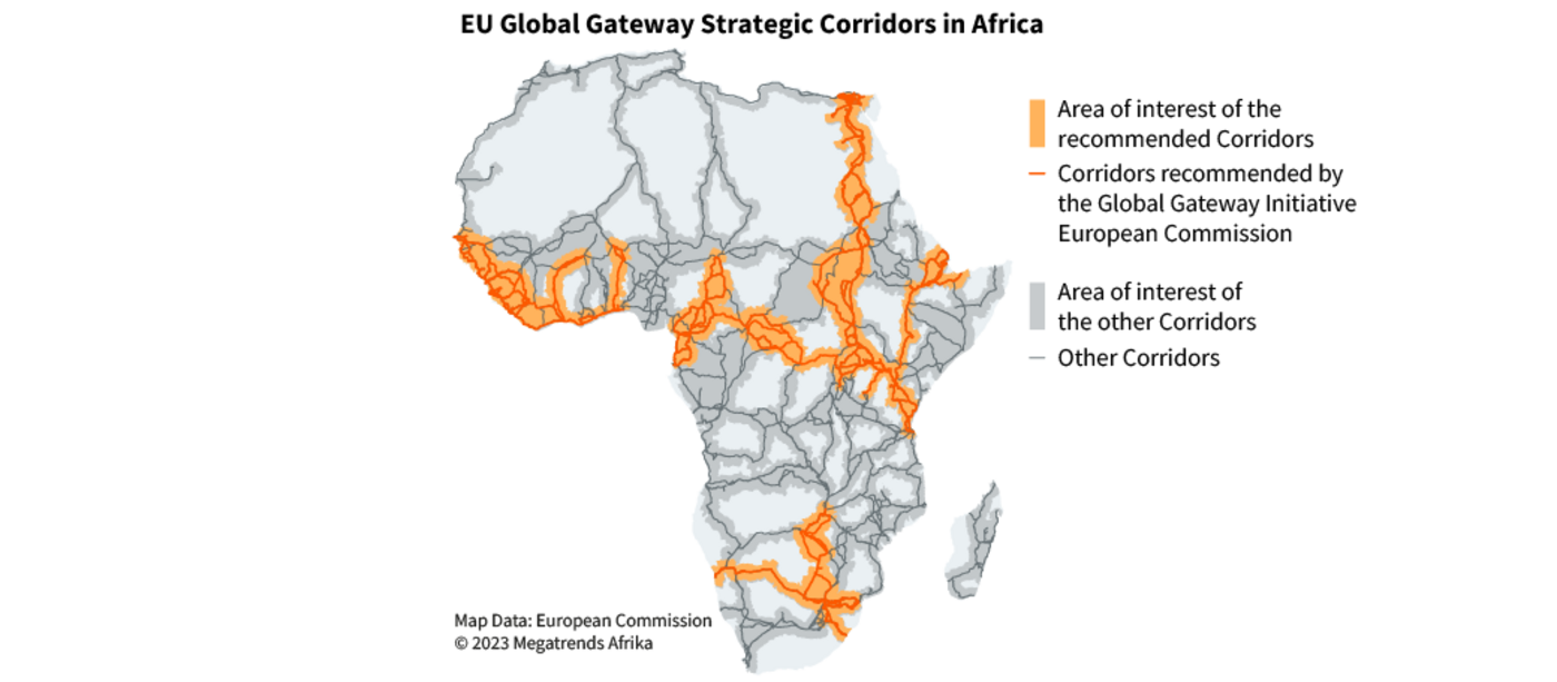
Technical, visually clear overview materials serve the planning and coordination purposes of the many actors involved. However, the focus on regional transport corridors also evokes historical memories and is, therefore, sensitive in terms of communication. Against this backdrop, planners in Brussels must face critical questions about the underlying “mental map” with which the EU operates in connection to the Global Gateway.
Supplementary visualizations should therefore offer a different perspective. These would make it clear that the EU and Team Europe actors are also taking account of the “mental maps” of other stakeholders. Various options can be considered. For example, Africa’s integration into global connectivity networks and interfaces with AU programmes for regional infrastructure and economic integration could be made more explicit. In addition, the focus could be shifted to the social contributions to health, education, and research that Global Gateway projects are also envisaged to make.
Visualizations could also focus on the local mobility of citizens, socio-economic activities, and the distribution processes around project locations, as well as the contributions made by African stakeholders. Interactive maps are particularly suitable for this purpose. These visualizations cannot be created without the participation of local actors. If we understand maps as representations of power relations that influence a viewer’s perceptions, they are relevant tools for pursuing the EU’s principle of having equal partnerships.